How data misleads
Lies, damned lies, and statistics

Data is often misrepresented to support an agenda. Have you ever wondered why people with opposing views can be dogged about their position? Often it's because they've been presented with information that suits their desired narrative, but not necessarily reality.
When I occasionally poke my head into the cesspool formerly known as Twitter, I see all the nonsensical rebuttals to climate change that probably make total sense to the person spouting them.
One of my favourites is that "climate change is not a problem because everything - infant mortality, extreme poverty, deaths from natural disasters, etc. - has been getting better for a century."
While this claim is accurate, the straight-line extrapolation of historical trends to the future is not. Still, many are convinced by this argument. Past good = future good. Those making that connection fail to look beyond the superficial. This is a failure to understand discontinuous change. A failure to understand that energy and technology can both lift humanity from poverty and send us to our graves. They fail to pick apart the nuances behind information.
I don't fault people for misunderstanding data, but I do fault them for closing their minds to contradictory information. Data and information is contextual and easy to misunderstand, depending on its presentation. I wasted a part of my career tweaking real data to make crappy financial products look good. I cherry-picked time periods, selected easier comparisons, manipulated axes, and so on, to put lipstick on pigs. It often worked because people didn't understand the data behind the depiction.
I wasn't unique. News media massages reality to attract eyes and ears. Shock sells.
Politicians and corporate sociopaths manipulate information to support their agenda and careers.
Since many people are either uncomfortable with numbers or don't look beyond what they're told, this is easy to do.
Here are a few ways data can mislead:
Selective Data Presentation: Highlighting only a particular time period or segment can give a skewed view, omitting context that could alter perceptions.
Misleading Scales and Axes: Manipulating or selectively choosing scales can exaggerate minor differences or minimize significant changes.
Misrepresentation through Percentages vs. Absolute Numbers: Presenting data in percentages without absolute numbers - or vice versa - can exaggerate or downplay the actual significance of a change.
Aggregation or Grouping of Data: Combining data into broader categories can obscure meaningful trends and differences within subcategories.
Ignoring Context or Baselines: Providing statistics without proper context, such as baseline figures, population growth, or total market size, can distort the significance of the reported changes.
Visual Manipulation: Using different visual formats (e.g., stacked charts vs. line graphs) can alter the viewer’s perception of relationships or trends.
Implying Causation from Correlation: Suggesting one factor directly causes another simply because they correlate can mislead, overlooking other influential factors or coincidental relationships.
Cherry-Picking Data Points: Selecting only the most favorable data points to support a specific narrative, while omitting contradictory data, can severely distort the true picture.
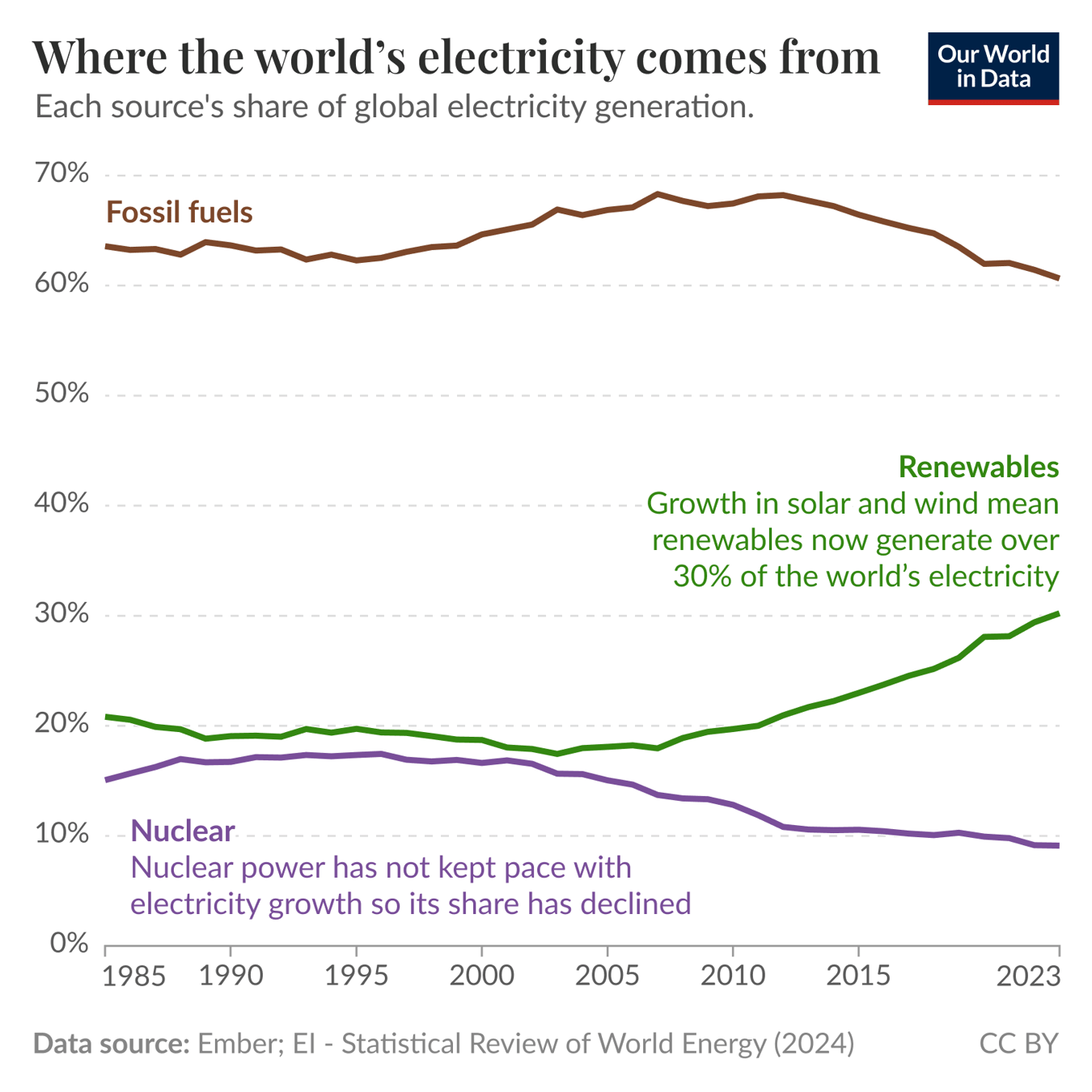
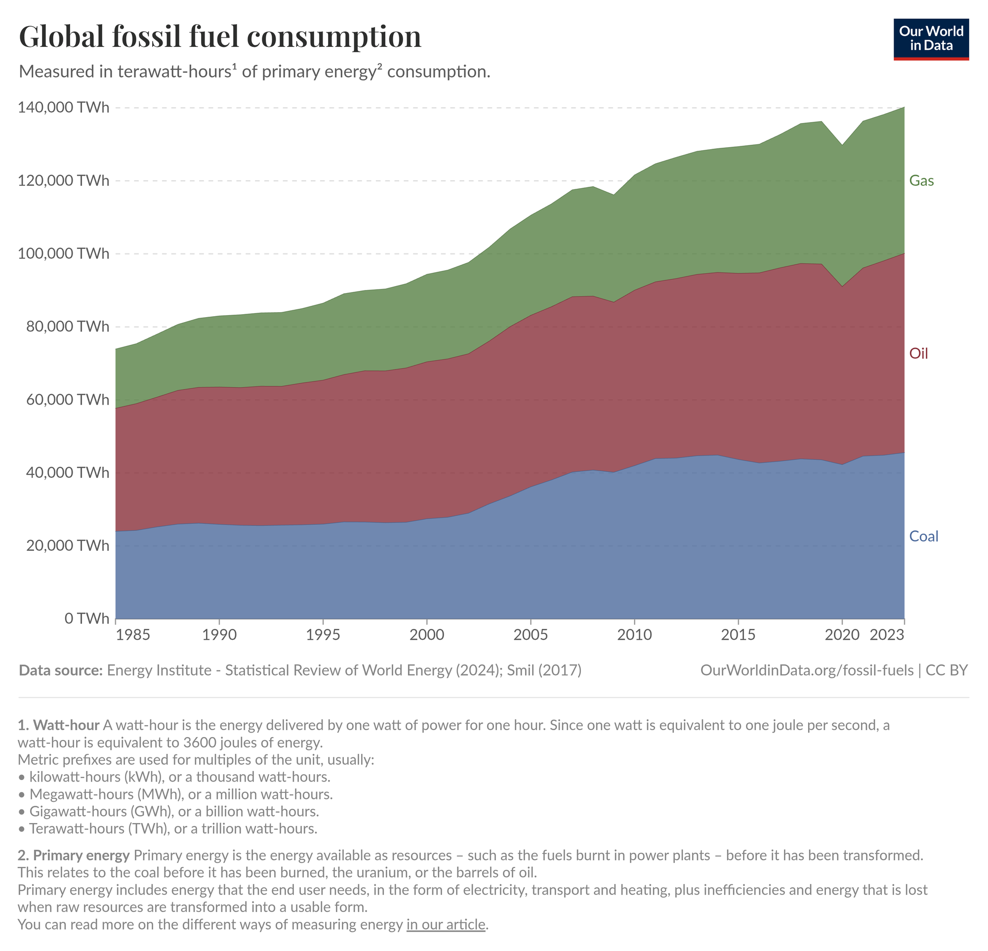
As it relates to the "energy transition", the two images below lead to conflicting conclusions, despite showing related information.
One chart measures total fossil fuel use in absolute terms (terawatt-hours), emphasizing continued growth. In contrast, the other chart uses percentage shares of electricity generation, highlighting rapid growth in renewables and declining relative usage of fossil fuels. By selecting different metrics, scales, and presentation methods (absolute vs. percentages, stacked areas vs. line charts), each chart can support a different narrative - either that renewable energy is successfully reducing fossil fuel dependence or that fossil fuel use is steadily rising.
My message: question any stats you see and understand the motives of the person presenting them.