14 Charts on Planetary Heating
Visual illustration of unfolding global catastrophe
I can tell you the planet is heating or I can show you.
If you’re reading this, you’re likely already collapse-aware. But seeing the global heating trends laid out in a series of charts just hammers it home.
Charts are also useful to share with any doubters out there. Sure, a single chart can be manipulated to convey a desired narrative. But here are 14 that provide heaps of corroborating evidence.
Let’s get started:
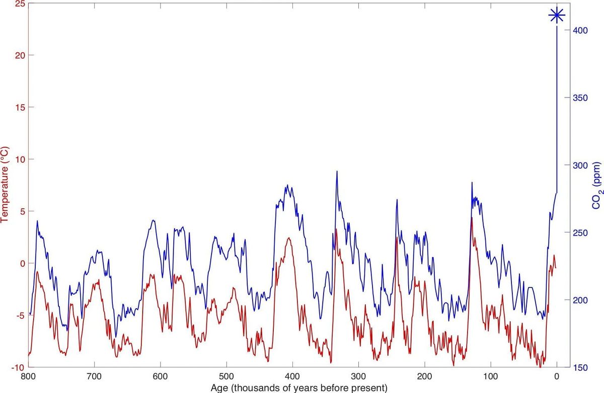
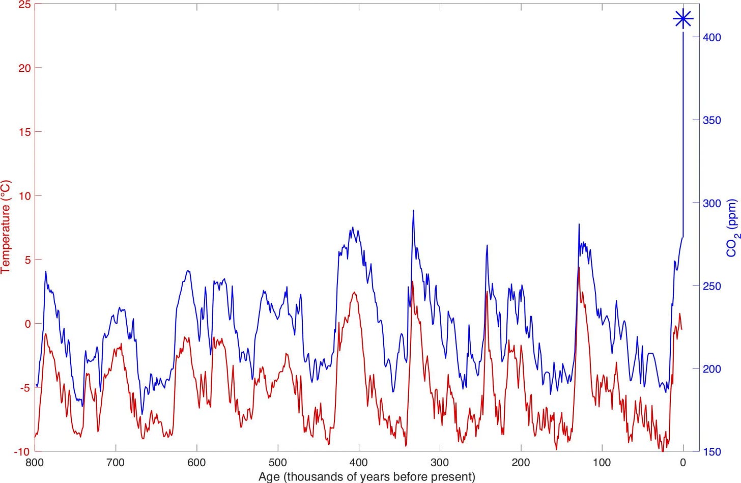
Atmospheric CO2 concentration has fluctuated over hundreds of thousands of years, but has remained in a band until recently. Following those CO2 fluctuations is global temperature. The recent explosion of atmospheric CO2 (almost double the historical peaks and still rising) to 430ppm suggests temperatures will rise far above historical norms.
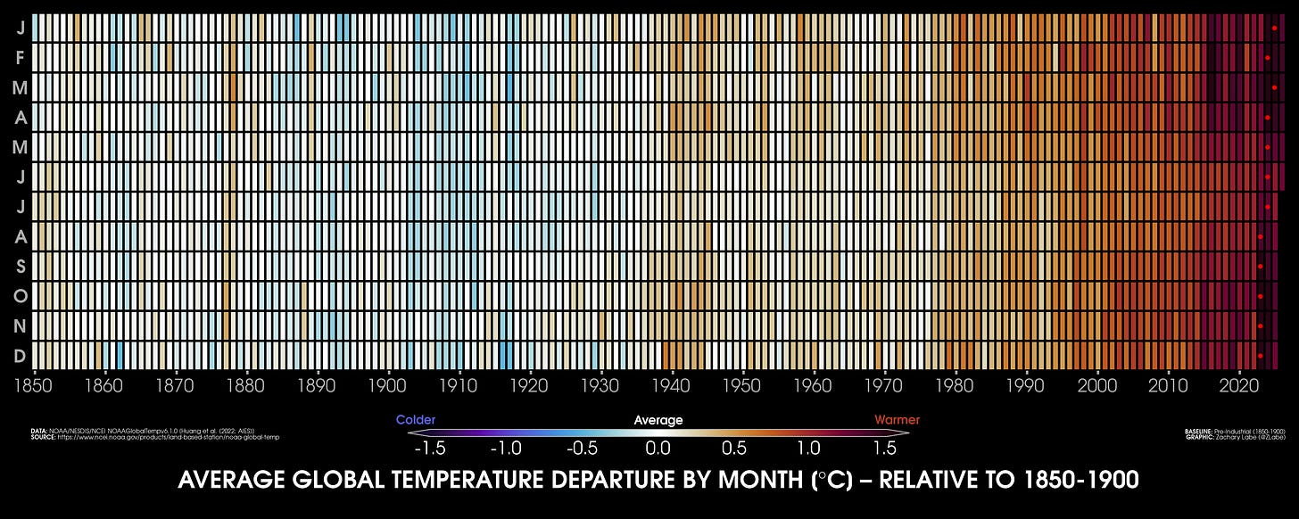
Temperatures are already clearly rising globally, increasingly so during the 21st century.
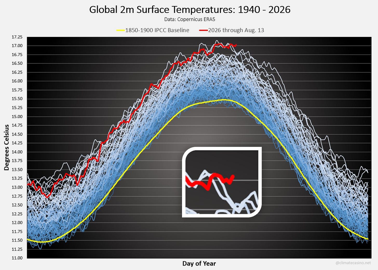
The day-to-day temperature data significantly exceeds the 1850-1900 baseline. August 13, 2026 was the hottest August 13 so far, exceeding 17 degrees Celsius on average globally.
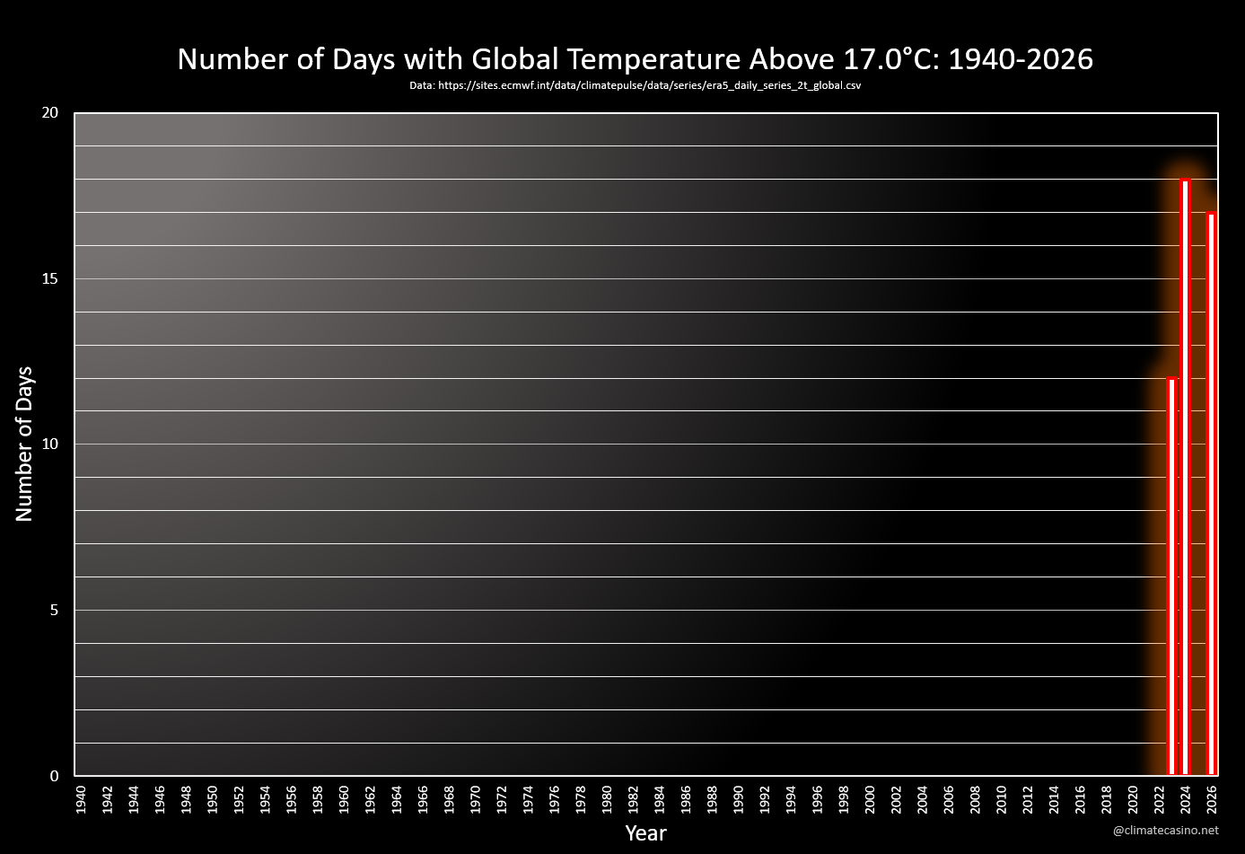
A global average temperature above 17 degrees Celsius was previously unheard of. Over the past few years, however, these occurrences have become more common.
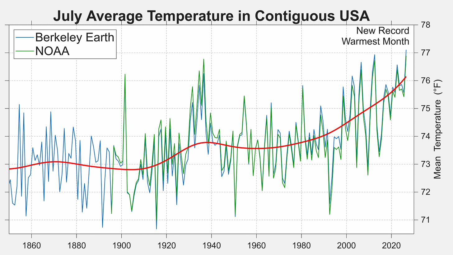
Regionally, we’re seeing the same heating trends. The chart below shows temperatures for the US. Not only are recent temperatures for the US breaking records, the multi-decade trendline is rising. Worse, the trend curve increasingly appears geometric.
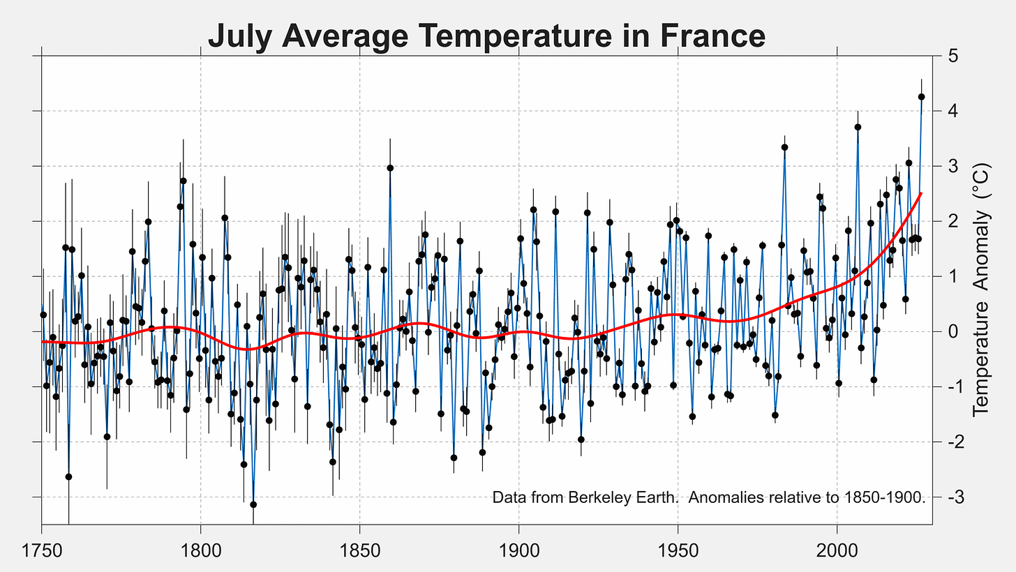
France: Same. Recent decades have clearly broken free from multi-century norms.
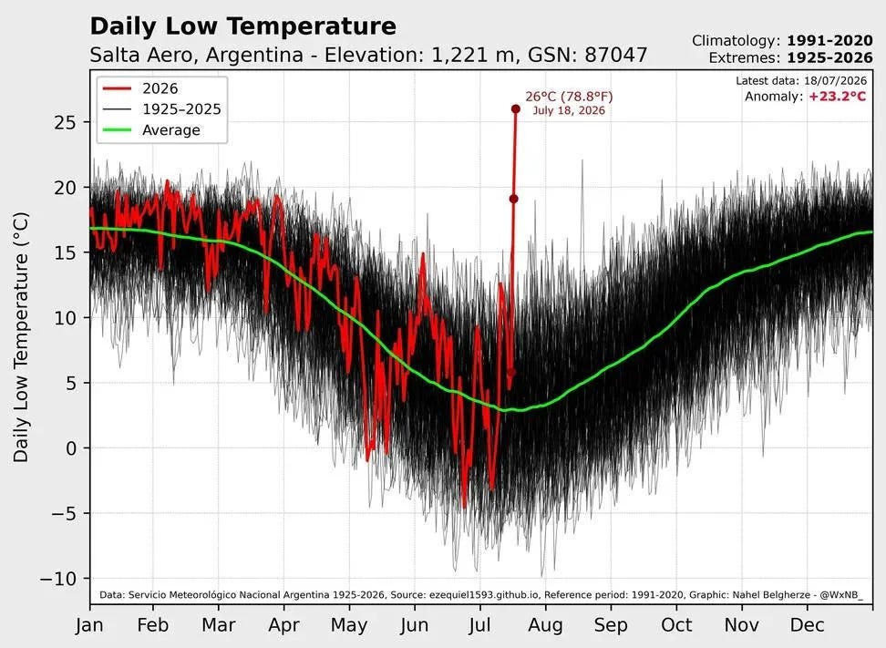
Another strange anomaly is the mid-winter spike in temperature in Salta Aero, Argentina. Recently hitting 26 degrees in July, about 20 degrees above average, this almost looks like an error. So far I have found nothing to indicate it is incorrect.
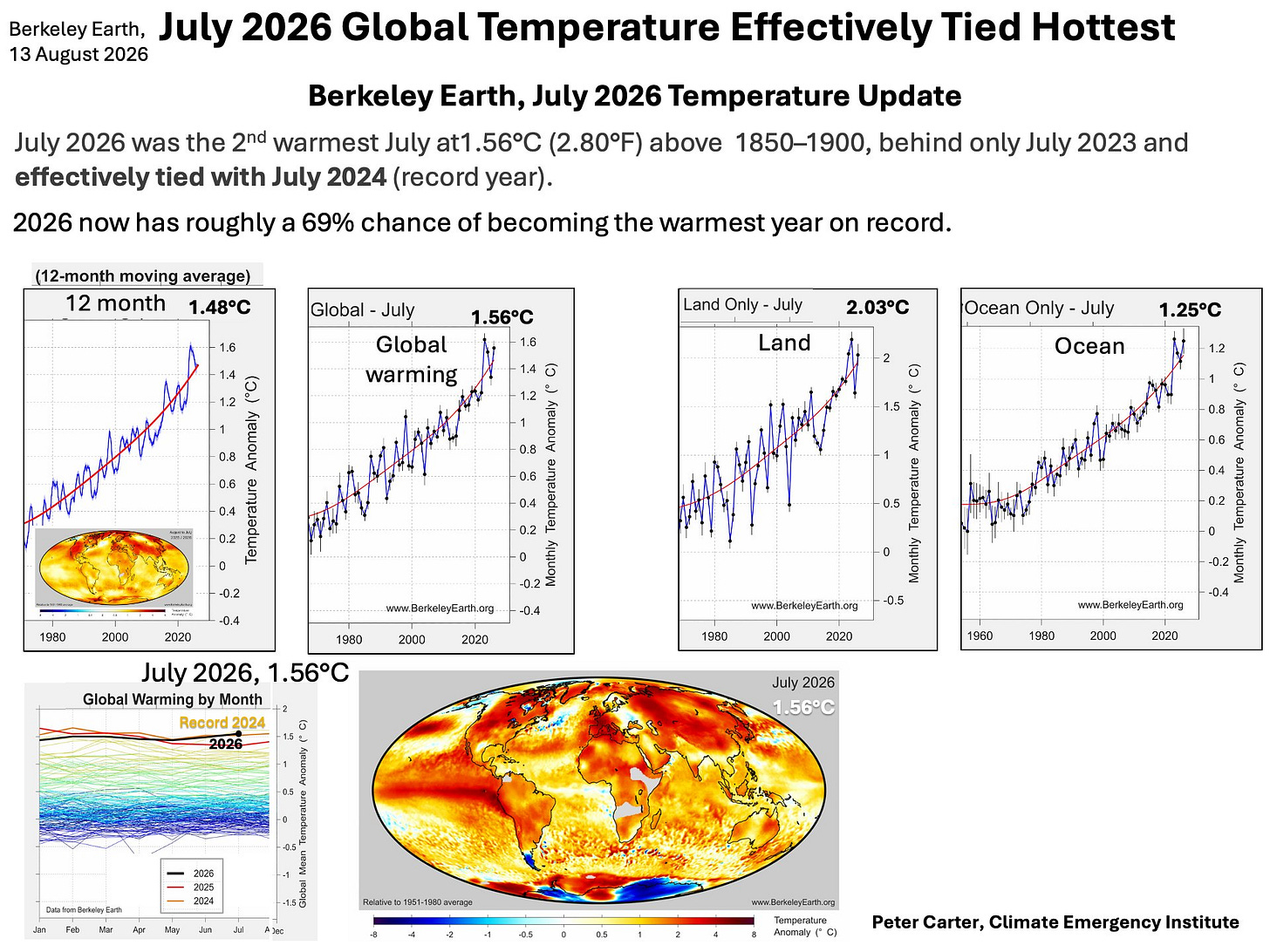
Oceans are also heating up at an accelerating pace. Were it not for the oceans, the world would be a lot hotter already. Unfortunately, there is a limit to how much the oceans can absorb.

The following charts displays the global, land, and ocean heating trends together, as of August 13, 2026. You can see how land (2.03 degrees anomaly) is heating up faster than the oceans (1.25 degrees anomaly).
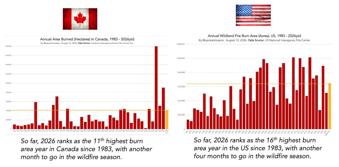
All this heat is creating more powerful, dangerous weather. Extreme weather patterns threaten crops and forests. The chart below shows how annual area burned in Canada and the US has risen. Just a snapshot of what’s happening around the world. And it’s gonna get worse.
It’s highly likely that 2027 is worse than 2026. El Nino is building and is primed to be the biggest since 1877. Expect torrential rain and droughts in unexpected places, putting cropland across the Americas and Asia at risk. The chart below shows the wave of heat moving east across the Pacific.
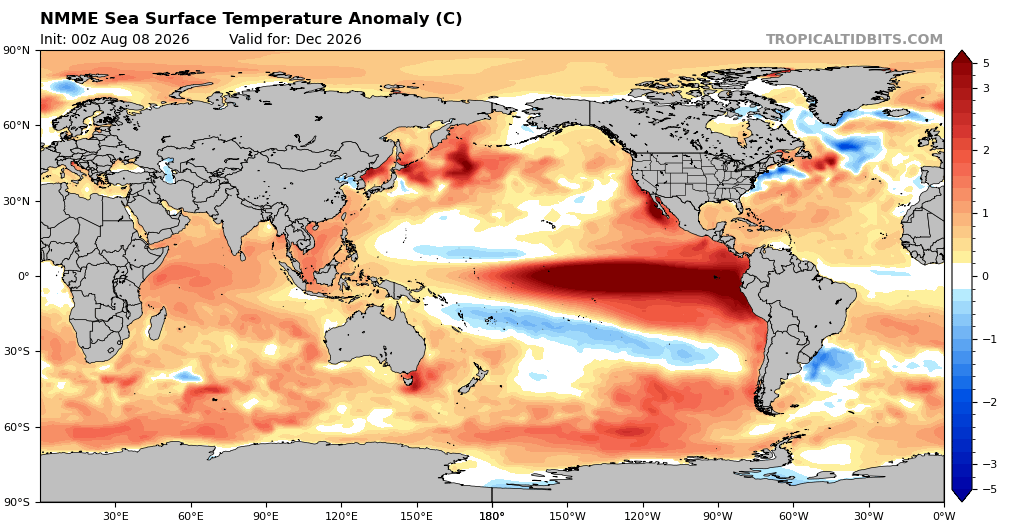
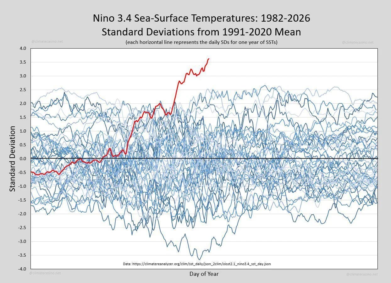
Illustrating the current El Nino’s power, this area of the world is seeing temperatures rise rapidly. The Nino 3.4 region is already tracking over 3.5 degrees above the mean. We haven’t even hit the peak yet.
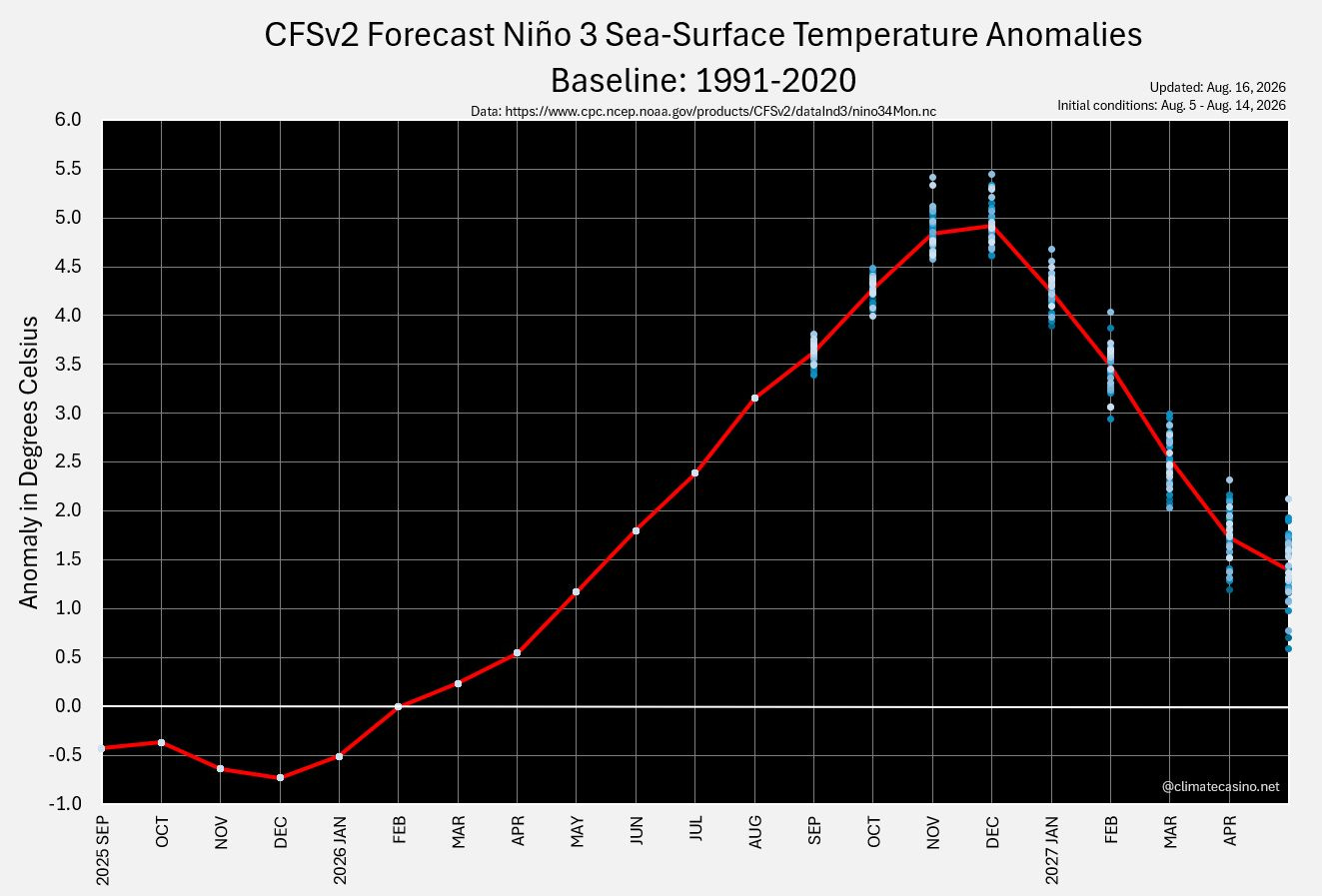
The forecasts for the peak effects of El Nino have been rising over the past few months. As of August 16th, the band of expectations has the sea surface temperature anomaly potentially hitting 5.5 degrees Celsius by December 2026.
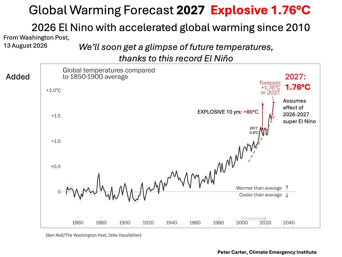
Globally, this El Nino will likely temporarily push the temperature anomaly to 1.76 degrees in 2027, providing a taste of what’s soon to come for our civilization.
Collapse 2050 is a reader-supported publication. To receive new posts and support my work, become a paid subscriber or make a one-time contribution.
Thanks
Sarah